Article: Abstract Cushions and Wall Art: How to Style Colour, Pattern and Prints Together
Abstract Cushions and Wall Art: How to Style Colour, Pattern and Prints Together
Abstract cushions are one of the easiest ways to make a room feel more pulled together. They bring colour and movement down from the wall and onto the sofa, bed or reading chair, so the room feels styled rather than simply decorated.
The key is not to match everything perfectly. A good abstract scheme usually works because one or two colours repeat, the scale of the patterns feels balanced, and the wall art gives the room a clear starting point. Start with abstract cushions, then build around the prints, framed art or canvas pieces you already love.

Why abstract cushions work well with wall art
Abstract artwork is naturally flexible. It does not need to describe a place, person or scene, so it can set the mood through colour, shape and texture. Cushions can echo that mood without making the room feel too themed.
If your wall art has soft blues and warm golds, a cushion with one of those colours can make the seating area feel connected. If your print is mainly neutral, a brighter cushion can add energy without asking you to change the whole room. This makes cushions a useful add-on when you are browsing abstract prints, canvas prints or framed wall art.
Start with one anchor colour from your print
Choose one colour from the artwork and repeat it two or three times around the room. It might be navy, ochre, terracotta, blush, sage or a warm neutral. The repeat does not need to be exact; it just needs to feel related.
For example, a blue and gold abstract print can work with a blue cushion, a brass lamp, a natural wood table and a mug or small accessory in a similar warm tone. That is enough repetition for the room to feel intentional without becoming too coordinated.

Pair bold cushions with simpler framed prints
If your cushions are busy, let the wall art do less. A calm framed print, a marble-style abstract or a softer colour field can stop the room becoming visually noisy. This works especially well in living rooms where cushions sit close to patterned rugs, books, throws or curtains.
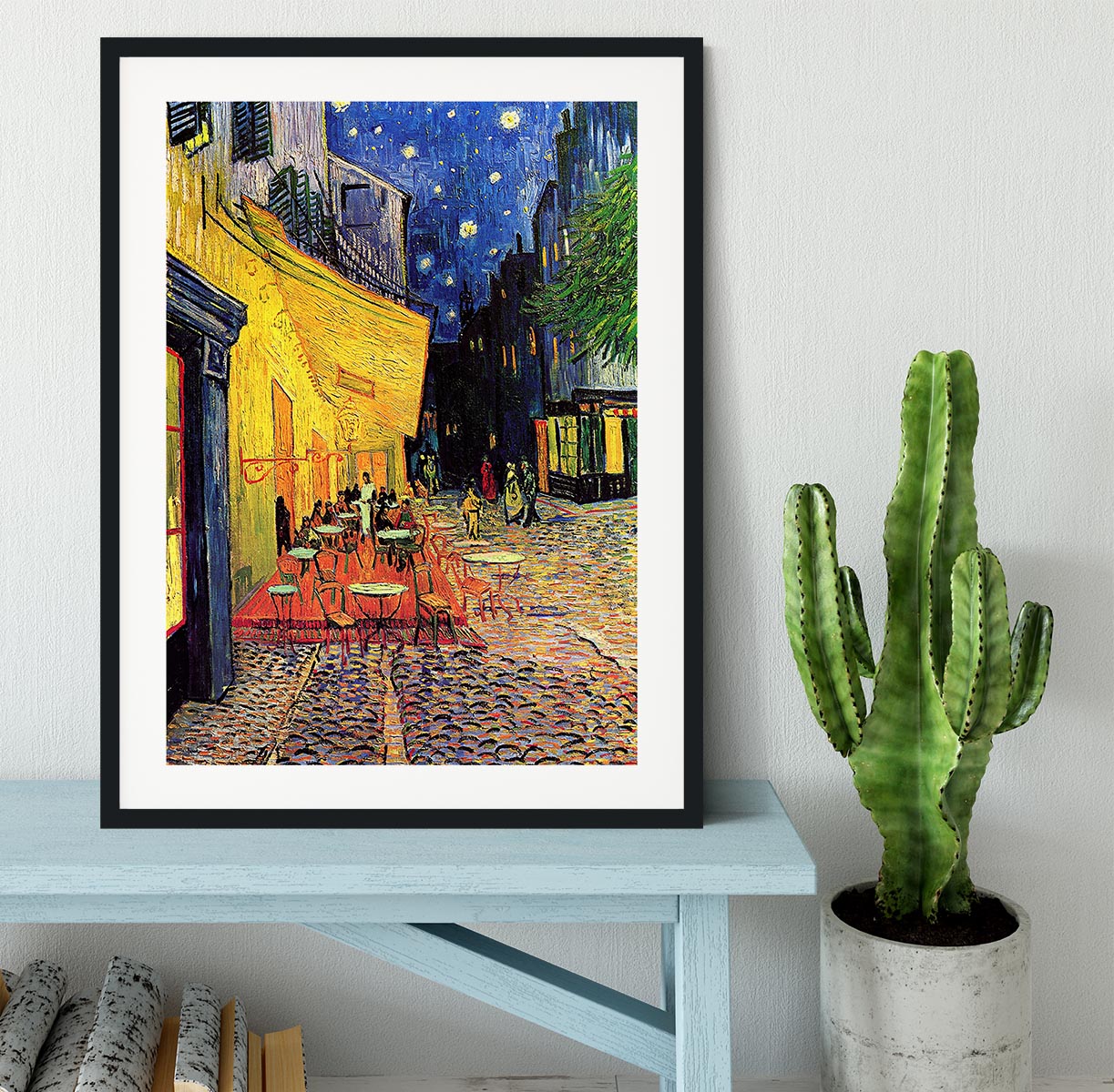
For a cleaner look, browse abstract framed prints and keep the cushion pattern as the more playful layer. For a bolder feature wall, reverse the rule: choose stronger wall art and keep the cushions simpler.

Use texture and scale so patterns do not fight
Two abstract patterns can sit together well if they work at different scales. Try a large, sweeping wall print with a smaller cushion pattern, or a detailed cushion beside a cleaner canvas print. If both pieces have tiny busy marks, the room can feel restless.
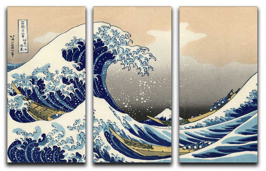
Scale matters on the wall too. A wider sofa or bed often needs a larger artwork or a multi-panel piece above it. A reading corner can take something smaller and more intimate. When the wall feels wide, abstract multi-panel canvas prints can help the artwork feel proportional to the furniture below.

Room ideas for sofas, beds, reading corners and home offices
Living room: choose one main abstract artwork above the sofa, then repeat one colour through two cushions and one small accessory. If the sofa is neutral, the cushions can carry more colour.
Bedroom: keep the palette quieter. A soft abstract framed print above the bed, with cushions in one matching colour, gives the room a restful look without feeling plain.
Reading corner: use a smaller framed print, one patterned cushion and a compact side table. This is a good place to be more playful because the scheme is contained.
Home office: choose abstract wall art with a clean palette, then add one cushion or mug that picks up a colour from the print. It gives the space personality without making it feel cluttered.
Build a matching abstract decor set
A simple set might start with one piece of canvas wall art or a poster, then add cushions and one small accent. This is where abstract mugs can help a desk, shelf or coffee table pick up the same colour story.
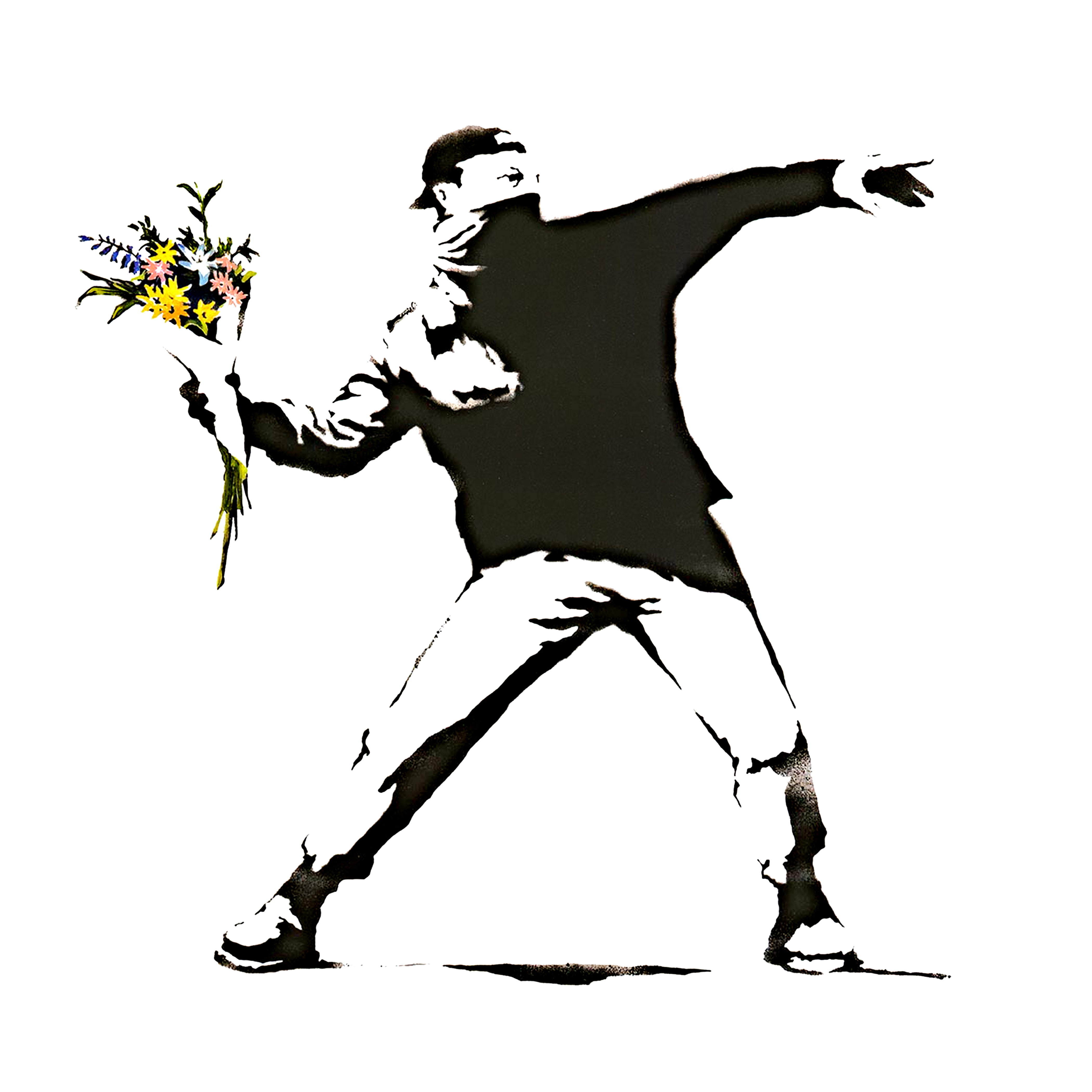
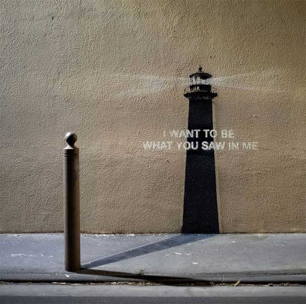
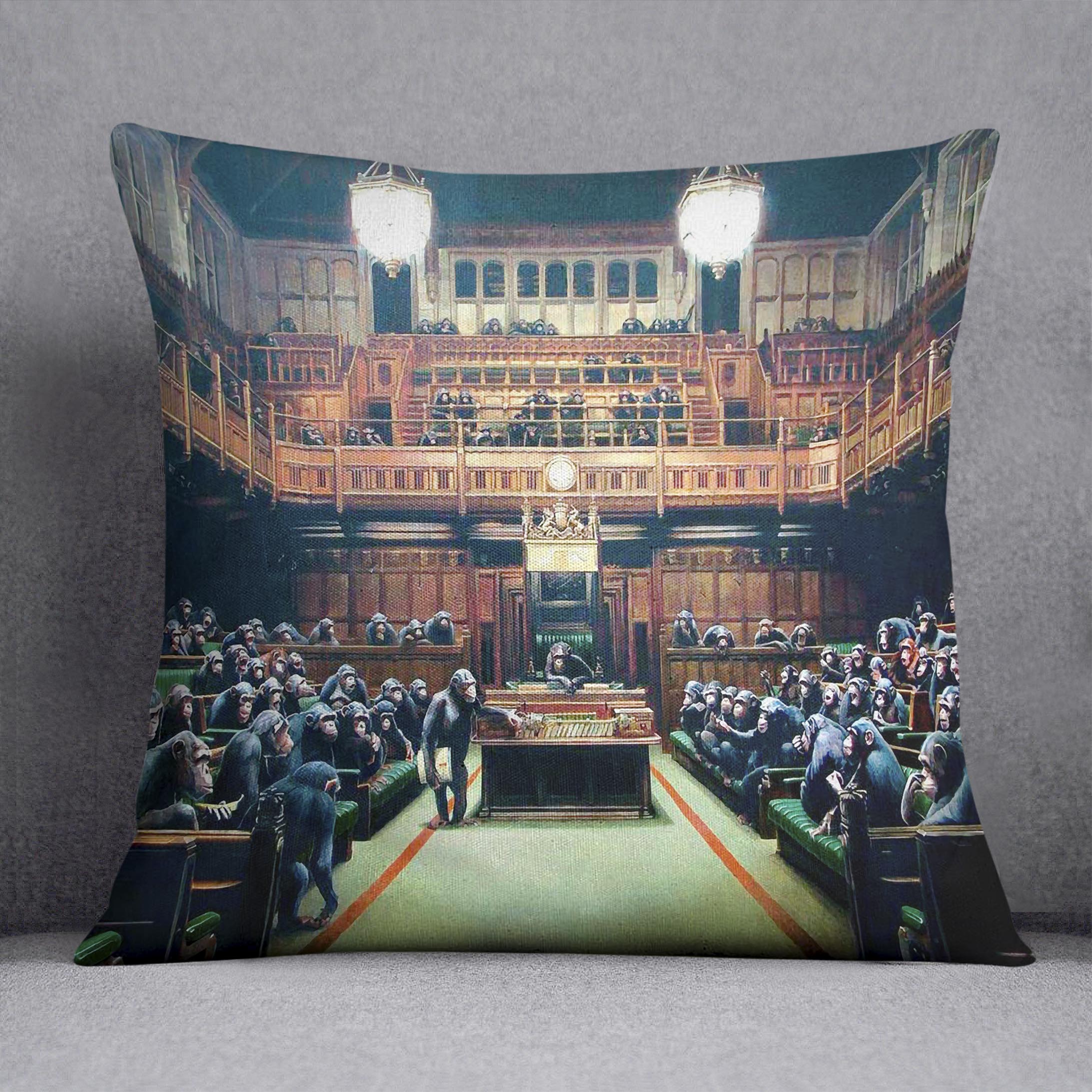
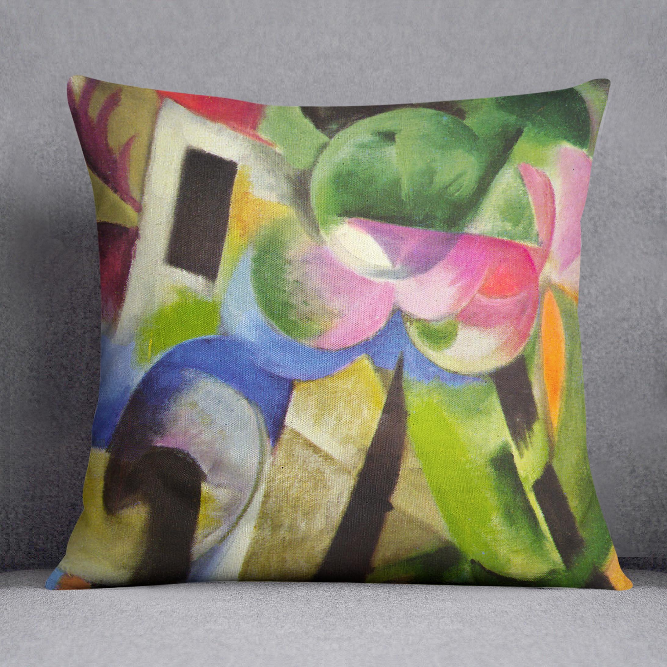
For a more art-led look, mix artist cushions with abstract wall art. The pieces do not need to be from the same artist. They just need a shared colour, mood or level of visual energy.

Quick styling checklist before you buy
- Choose one anchor colour from the artwork and repeat it in the cushions.
- Balance busy patterns with calmer prints, or bold wall art with simpler cushions.
- Use different pattern scales so the room does not feel crowded.
- Match the artwork size to the furniture below it.
- Add one small accessory only if it helps the colour story.
Best places to browse next
Start with abstract cushions if you want a quick room refresh, then pair them with abstract canvas prints and posters or abstract framed prints for the wall. If you are styling a wider space, compare abstract multi-panel canvas art too.
For more inspiration, see our guide to styling art-inspired cushions with wall art, or browse modern abstract art ideas for contemporary homes.
Ready to start? Browse the abstract cushions collection and build a colour-led room scheme around your favourite print.