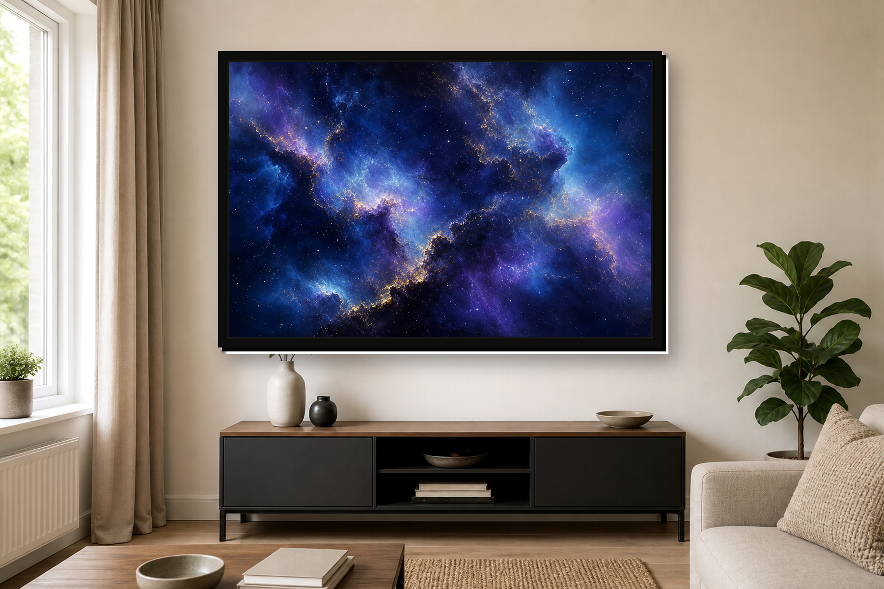
Abstract Framed Canvas Prints: How to Choose Colour, Frame and Size
Abstract framed canvas prints are a good choice when you want a room to feel considered, modern and personal without choosing a literal subject. Colour, texture, frame style and scale do most of the work, so the right piece can pull a space together without making it feel busy.
If you are comparing abstract framed prints, abstract floating-frame canvas prints and standard abstract canvas prints, use this guide to narrow the choice by room, colour and size. The aim is not to find the loudest print, but the one that makes the rest of the room feel more deliberate.

Why framed abstract art works so well in modern rooms
Abstract wall art is flexible because it does not lock the room to one place, person or theme. A framed abstract print can work in a living room, bedroom, hallway, office or open-plan space because the focus is on mood: calm, bold, warm, minimal, dramatic or soft.
The frame matters because it gives the artwork a clearer edge. In a room with clean furniture, a framed piece can make abstract colour feel polished rather than unfinished. In a softer room, the frame helps the print hold its place among textiles, plants, books and layered decor.
That is also why abstract art is useful when you already have patterned cushions, rugs or curtains. Instead of adding another recognisable subject, it can repeat a colour, introduce movement, or create a focal point without fighting everything else in the space.
Framed print, floating-frame canvas, standard canvas or multi-panel?
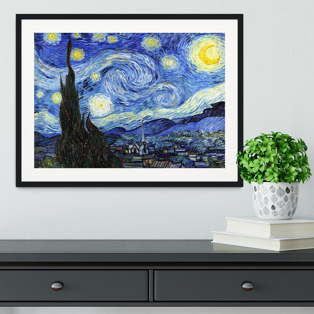
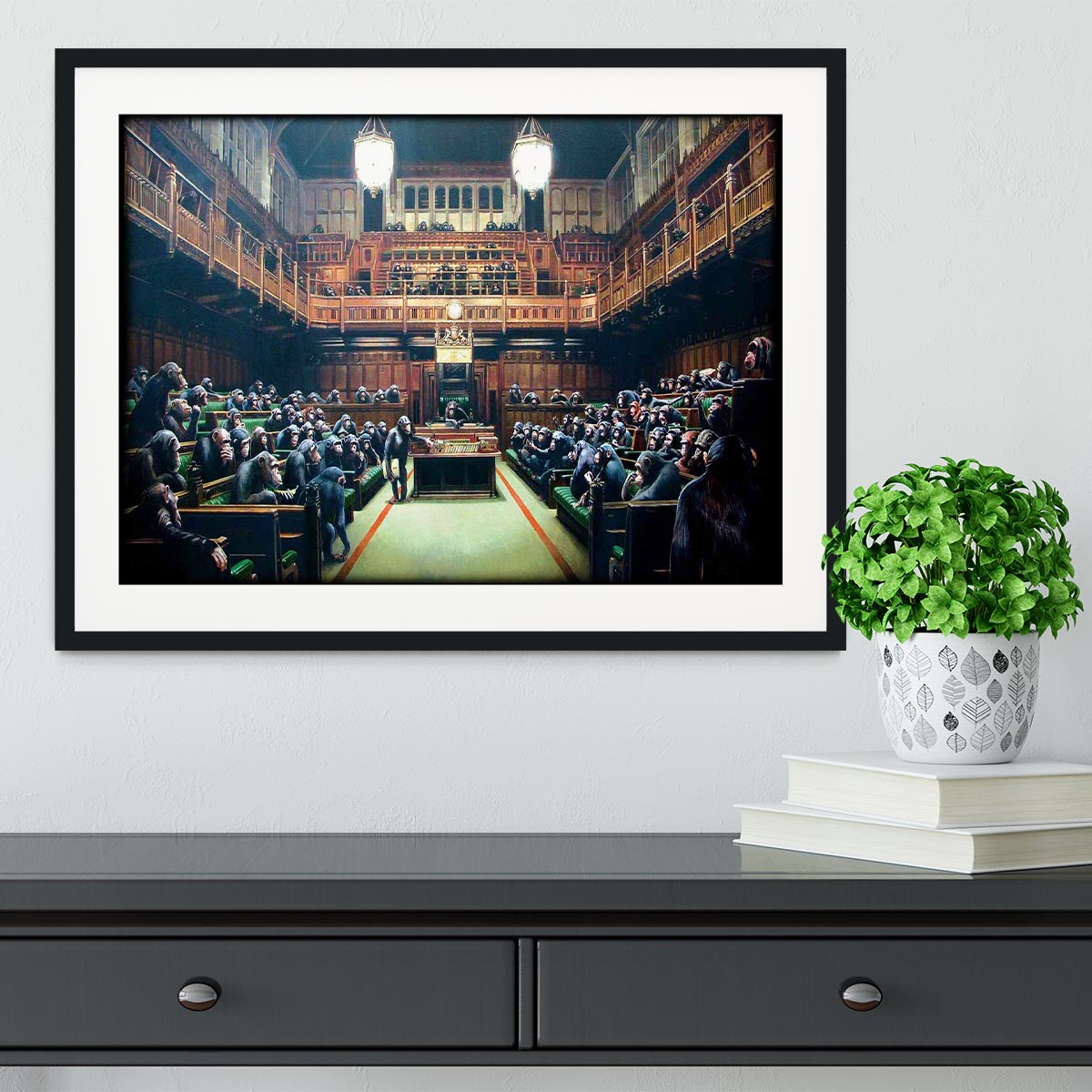
Choose a framed print when you want a smarter, more gallery-like finish. Framed abstract wall art suits hallways, dining rooms, home offices and living rooms where the artwork needs to feel neat and intentional.
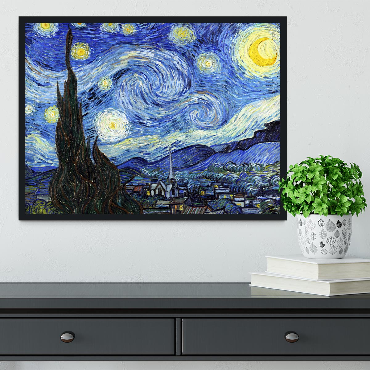
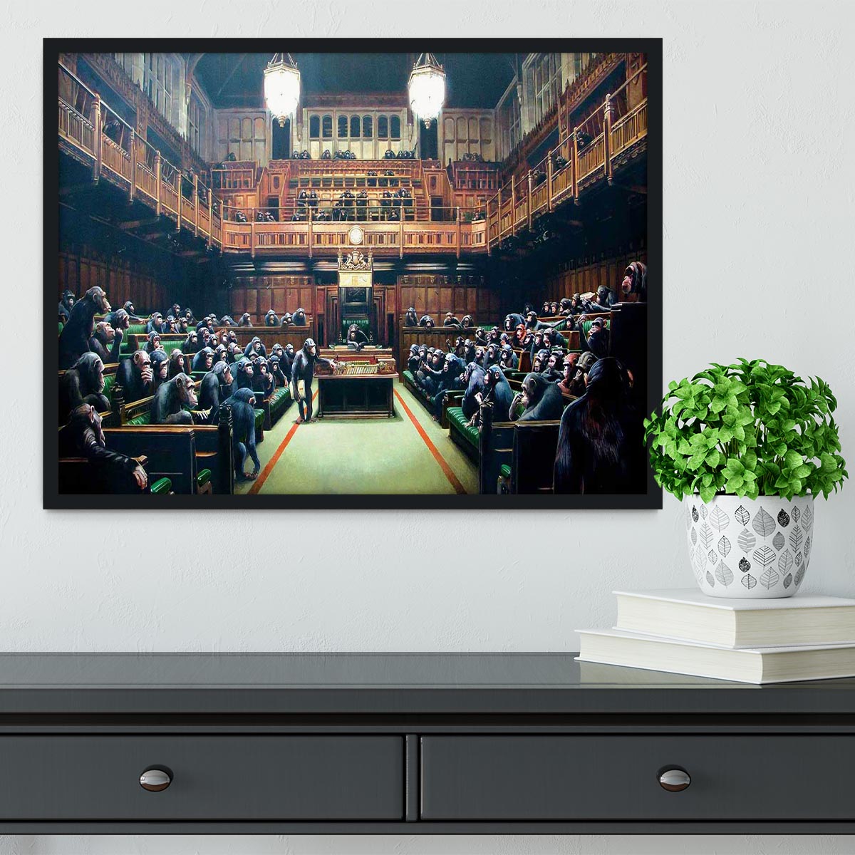
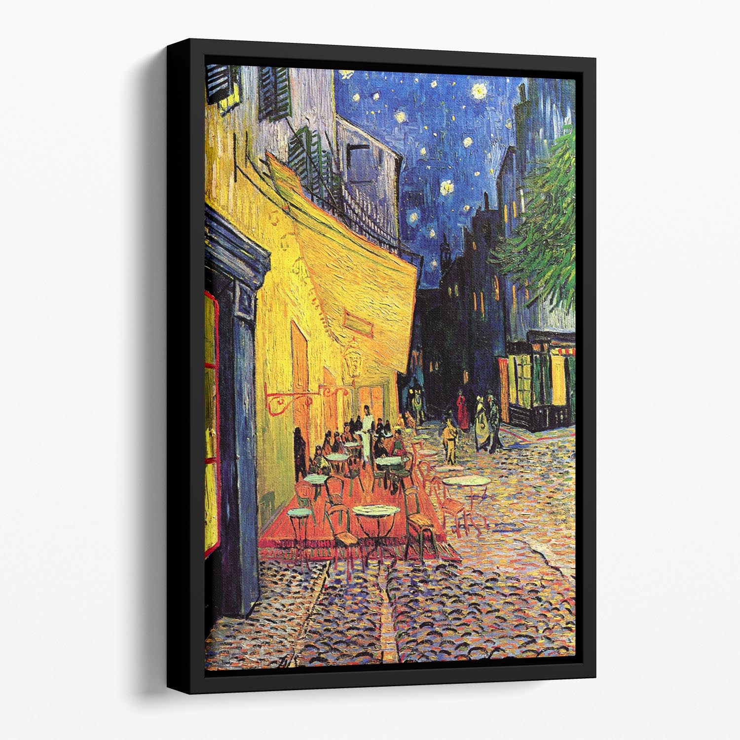
Choose a floating-frame canvas when you like the depth of canvas but want a more finished outer edge. The small shadow gap around the canvas can make the piece feel more substantial, especially above a sofa, sideboard or bed.
Choose a standard abstract canvas print when you want a relaxed, easy wall art finish. This route works well for bedrooms, creative spaces and rooms where a traditional frame might feel too formal.
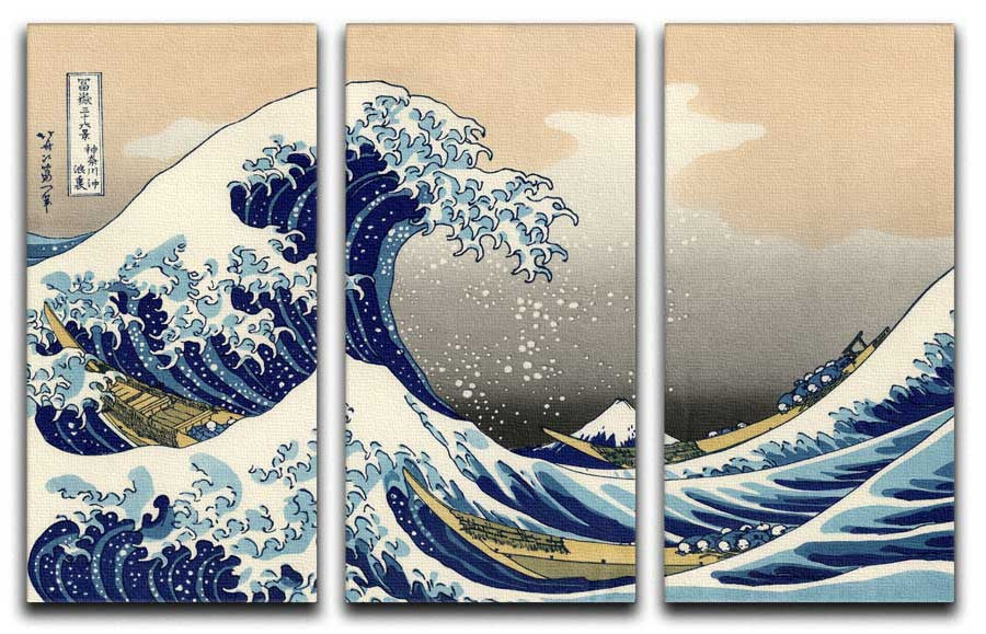
Choose abstract multi-panel canvas wall art when the wall is wide and one single print might look too small. Split-panel pieces can stretch across a sofa, bed or dining bench while still feeling light on the wall.

How to choose colours without making the room feel busy
Start with the colours already in the room. If your sofa, rug or curtains are already strong, choose abstract art that repeats one or two of those shades rather than adding a completely new palette. This keeps the print connected to the room.
For calm rooms, look for soft neutrals, greys, creams, muted blues, gentle greens or marble-style textures. These work well in bedrooms, reading corners and rooms where you want the artwork to add depth rather than energy.
For bolder rooms, let the artwork introduce one confident accent. Blue and gold, black and gold, teal, rust, pink or purple can work well when those colours are echoed in one or two smaller details elsewhere. The safest approach is to repeat the accent in cushions, a lamp, a vase or a throw, not across every item in the room.

Best rooms for abstract framed wall art
In a living room, abstract framed canvas prints usually work best above the sofa, above a console, or as part of a controlled gallery wall. If the furniture below is wide, avoid choosing a piece that feels too narrow. A larger framed print or floating-frame canvas will usually look more balanced.
In a bedroom, abstract art should feel restful rather than hectic. Softer lines, muted colours and gentle texture tend to work better than very sharp contrast. Above the bed, keep the artwork centred and give it enough breathing room so the wall does not feel crowded.
In a hallway, framed abstract prints can add colour and movement without needing a deep theme. A narrow hallway may suit one strong vertical piece, while a wider landing can take a small group of two or three related prints.
In a home office, abstract wall art can add focus without becoming distracting. Cooler colours, monochrome pieces or structured geometric designs often work well near desks and shelving.
Size guide: small accents, over-sofa pieces and large statement walls
For a small accent wall, choose a framed print that has enough contrast to be noticed but does not overpower the space. This works well beside a reading chair, in a hallway, or above a small cabinet.
For a sofa or bed, the artwork should normally feel connected to the furniture below it. If the print is much narrower than the sofa, it can look accidental. A wider floating-frame canvas, a pair of framed prints, or a five split-panel abstract canvas can work better on larger walls.
For a statement wall, think about viewing distance. Large abstract canvas prints can look excellent in open-plan rooms because you can stand back and see the whole composition. In smaller rooms, a very large, high-contrast piece may dominate, so a softer palette is usually easier to live with.

Pairing abstract wall art with cushions and other decor
Abstract art is easy to pair with cushions because you can connect by colour rather than subject. If the artwork contains blue, gold, green or pink, one small accessory in a similar shade can make the room feel styled without becoming too coordinated.
For a sofa, try one larger abstract artwork behind the seating and then use two or three cushions in related tones. Browse abstract cushions if you want the room to pick up the artwork's colours in a softer way.
Keep the rest of the styling simple if the artwork is already busy. Plain throws, simple lamps, natural wood, black frames, white ceramics and plants all work well because they give the abstract piece space to breathe.

Quick buyer checklist before you choose
Before you choose, ask five quick questions. Does the colour connect to something already in the room? Does the size suit the furniture below it? Would a framed print, floating-frame canvas or standard canvas fit the room's finish best? Is the image calm enough for a bedroom or bold enough for a living space? Does the wall need one piece, a pair, or a wider multi-panel layout?
If you are unsure, start with the room's existing palette and choose the finish second. A calm neutral framed abstract print will usually be easier to place. A colourful floating-frame canvas will usually feel more like a feature. A split-panel layout is strongest when the wall needs width and rhythm.
Shop abstract framed prints and abstract canvas wall art
Ready to browse? Start with abstract framed prints if you want a polished, gallery-style finish, or compare abstract floating-frame canvas prints if you prefer depth with a clean framed edge.
For a broader route, explore abstract canvas prints, abstract multi-panel canvas and abstract cushions. You can also compare wider styling ideas in our guides to modern abstract art and large wall art ideas.
FAQs
Are abstract framed canvas prints better for modern rooms?
They work especially well in modern rooms because the frame gives the artwork a clean edge, while the abstract design adds colour and movement without forcing a fixed theme.
Should abstract wall art match the sofa?
It does not need to match exactly. A better approach is to repeat one or two colours from the room so the artwork feels connected without looking overly coordinated.
When should I choose a floating-frame canvas?
Choose a floating-frame canvas when you want the depth of canvas with a more finished edge. It is a strong option for living rooms, bedrooms and feature walls where the artwork needs more presence.