
Pop Art Wall Art Ideas: How to Use Bold Prints, Canvas and Colour at Home
Pop art is one of the easiest ways to make a room feel more confident. It brings colour, graphic impact and a sense of fun without needing a complete redesign. If your space feels a little safe, a bold print can become the piece that pulls the room together.
This guide looks at practical pop art wall art ideas for UK homes, including where to use bright prints, how to choose colours, and when to pick canvas, framed prints or a more premium floating frame. If you already know you want something bold, start with our pop art canvas prints collection.

Why pop art works so well as statement wall art
Pop art is made for impact. Strong colour, clean shapes, familiar culture references and graphic contrast all help it stand out from softer decorative prints. That makes it especially useful in rooms where you want one clear focal point rather than lots of small details competing for attention.
It also suits modern homes because it can be playful without feeling messy. A single colourful canvas above a sofa, desk or sideboard can lift neutral furniture and make the whole space feel more designed.
Best rooms for pop art: living rooms, bedrooms, offices and games rooms
In a living room, pop art can sit above the main sofa or fireplace as the visual centre of the space. Choose a size that feels intentional; if the wall is wide, a piece that is too small can look lost.
Bedrooms usually need a slightly softer approach. A bright print can work above a bed or dressing table, but it is worth repeating one or two colours in cushions, bedding or accessories so the artwork feels connected to the room.
Home offices, games rooms and music spaces can take more energy. These rooms are ideal for bolder subjects, retro graphics and culture-led pieces. You can also browse music canvas prints if you want the same statement feel with a music-led theme.

How to choose the right colour palette without overwhelming the room
The safest way to style bright wall art is to let the print lead, then keep the surrounding room calmer. White, grey, black, natural wood and soft neutrals all give pop art enough contrast to stand out.
If you want a more colourful room, choose two or three shades from the artwork and repeat them carefully. For example, a red, yellow and blue print can be echoed through a lamp, cushion or small decorative object. Avoid matching every colour exactly; the room should feel coordinated, not forced.
Canvas, framed print or floating frame: which format fits the look?
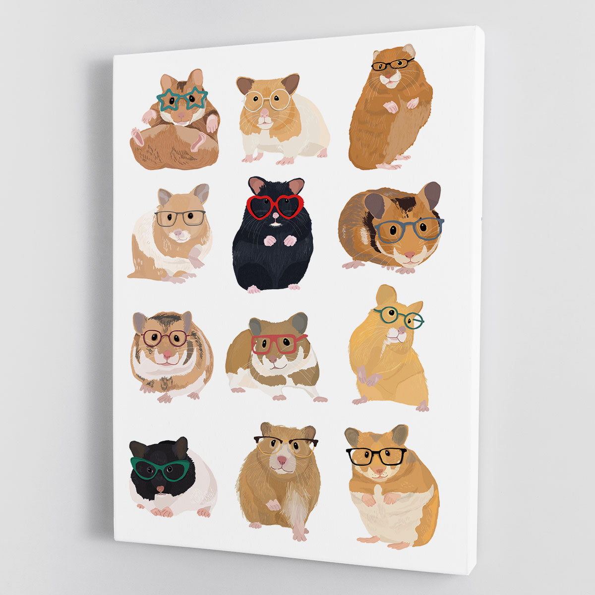
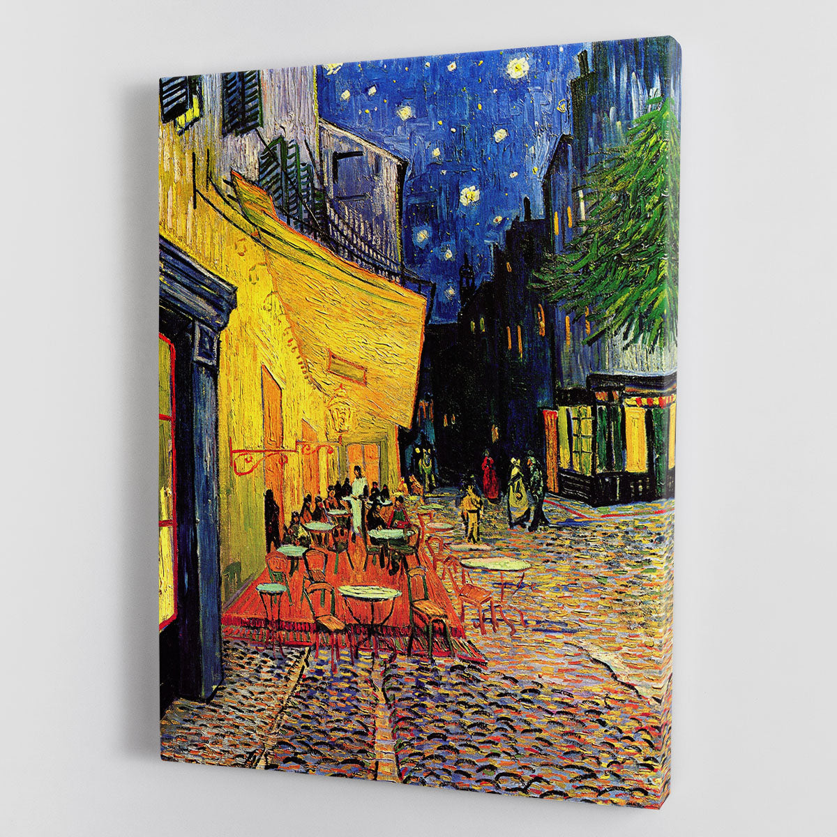
Canvas prints and posters are a strong route for relaxed, colourful rooms. Canvas gives the image presence without adding visual fuss, which suits the clean graphic style of pop art.
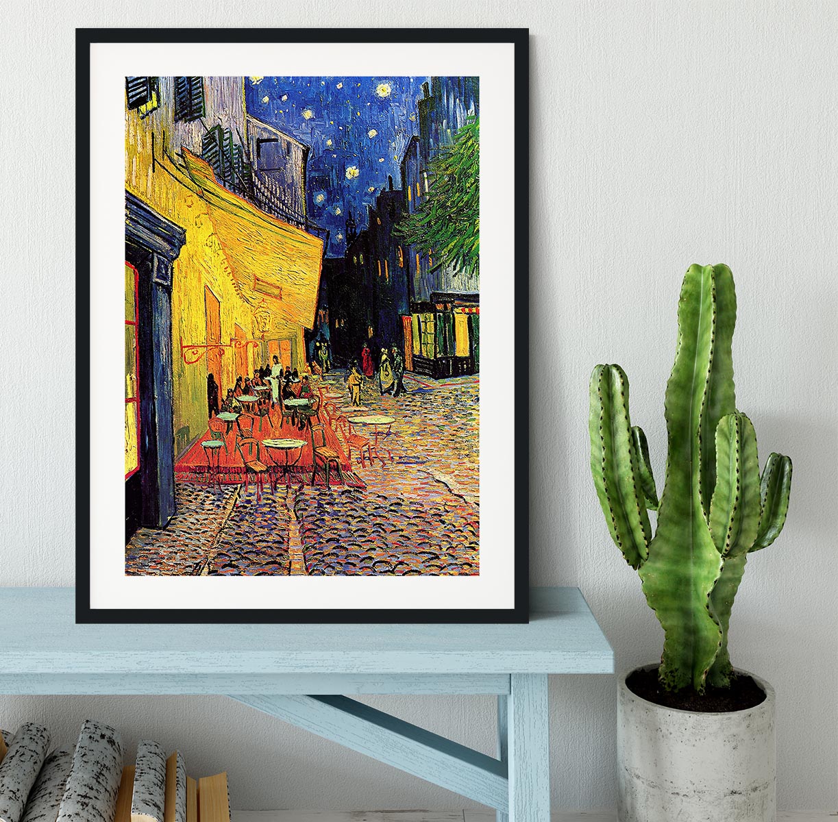
Framed prints are better if you want a sharper, more finished look. They can make colourful artwork feel more grown-up, especially in dining rooms, offices or smarter living spaces.
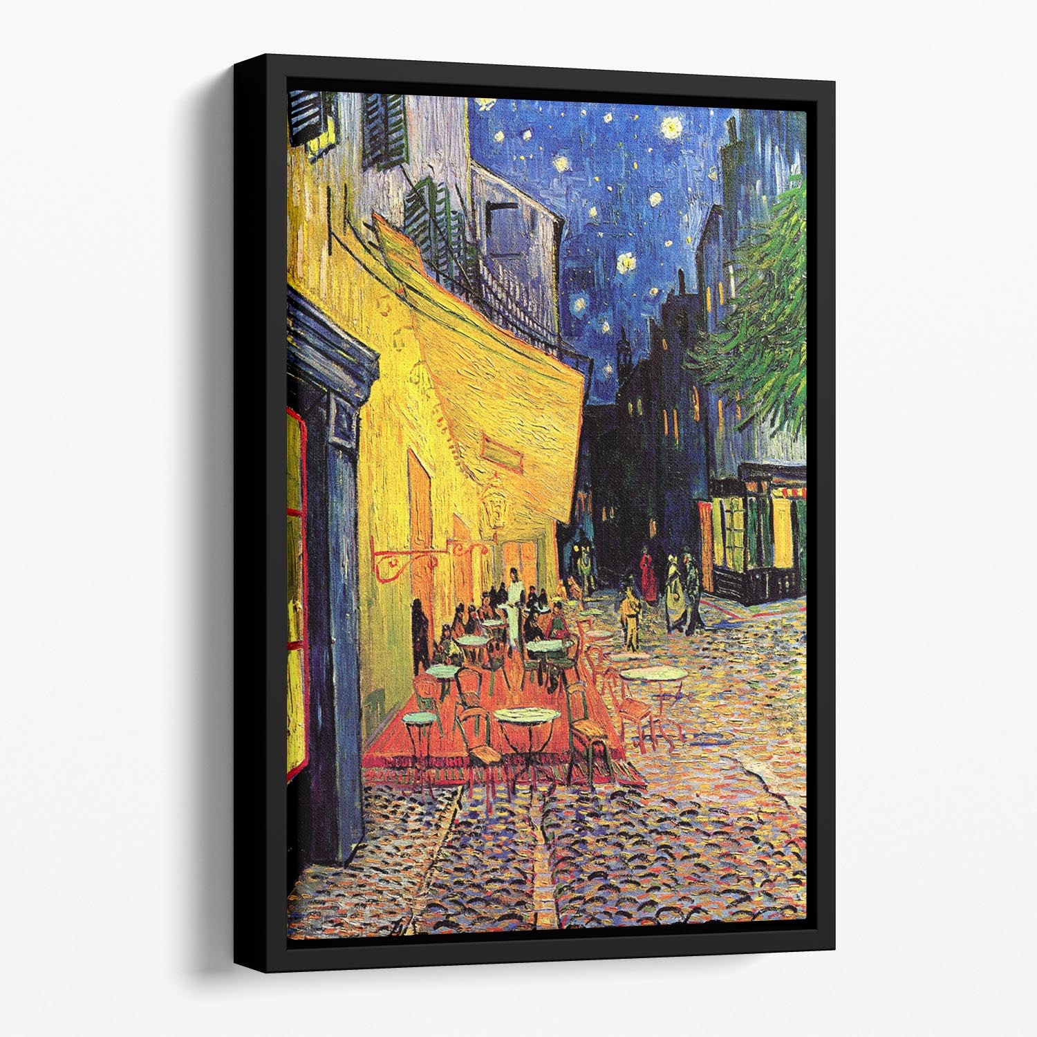
For a more premium statement, a floating framed canvas print adds depth around the artwork while keeping the impact of canvas. It is a good option when the print is going on a main wall and you want it to feel like a proper feature.

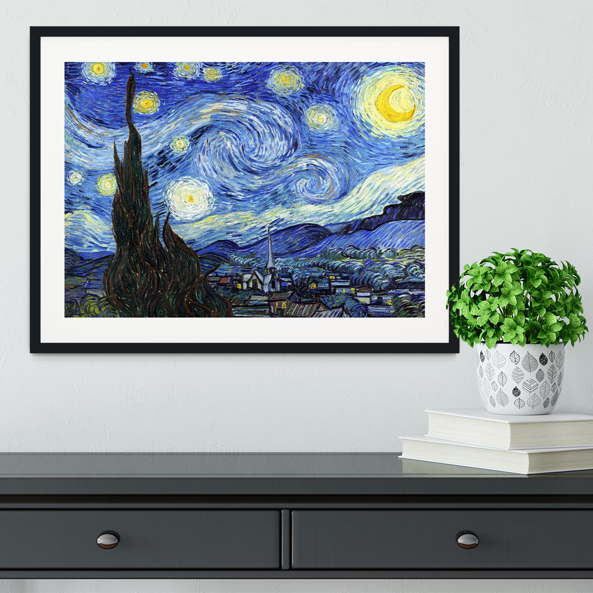
Pop art themes to consider: music, film, street art, portraits and retro graphics
Pop art can cover a lot of moods. Portrait-led pieces feel iconic and fashion-inspired. Retro graphics bring a playful mid-century or vintage feel. Music and film-inspired prints work well in entertainment spaces, bedrooms and home bars.
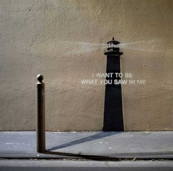
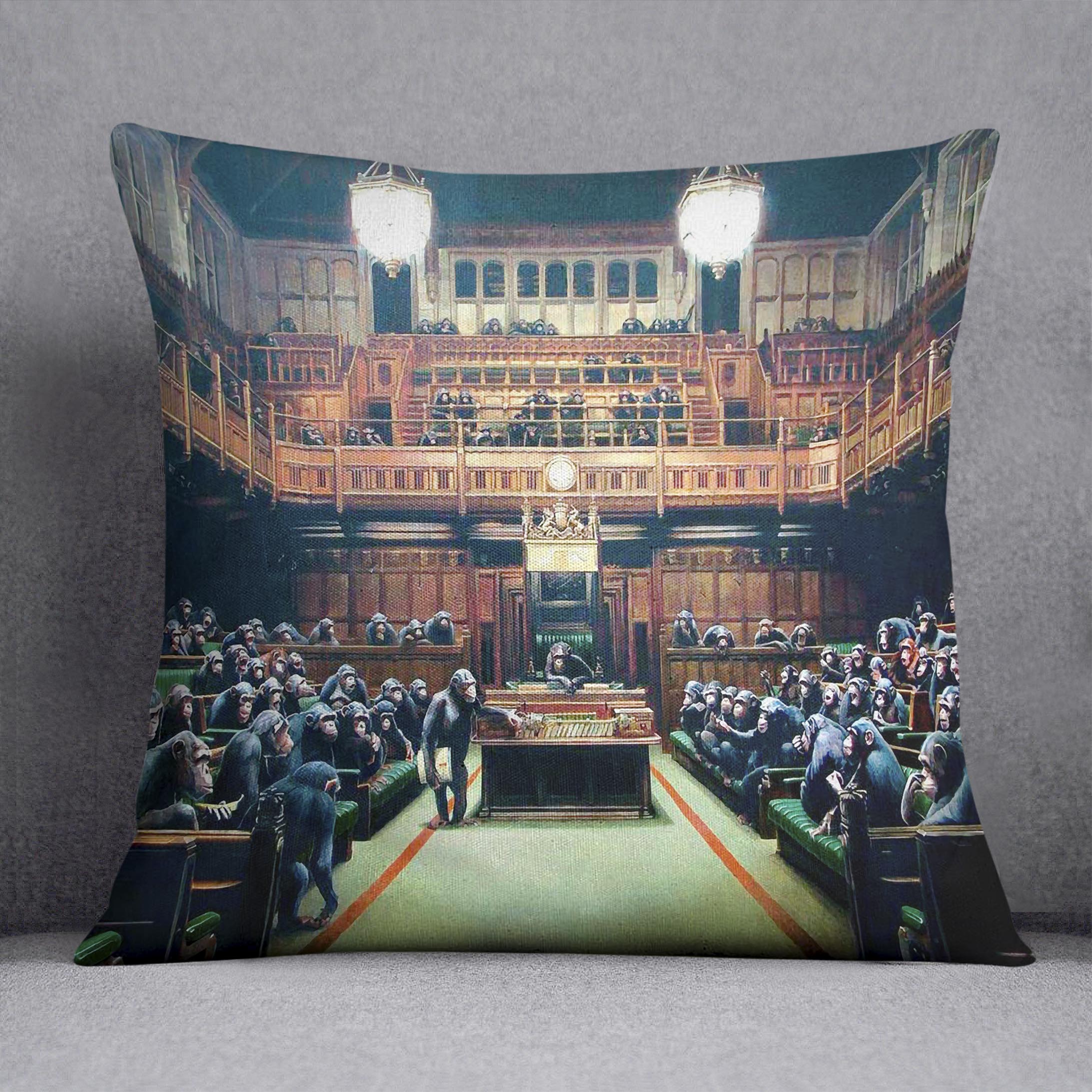
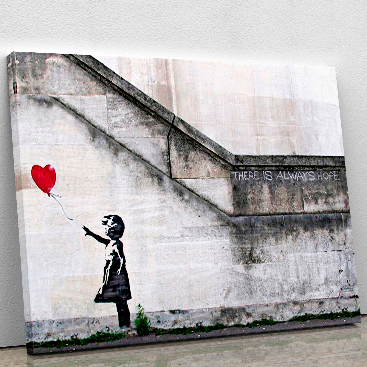
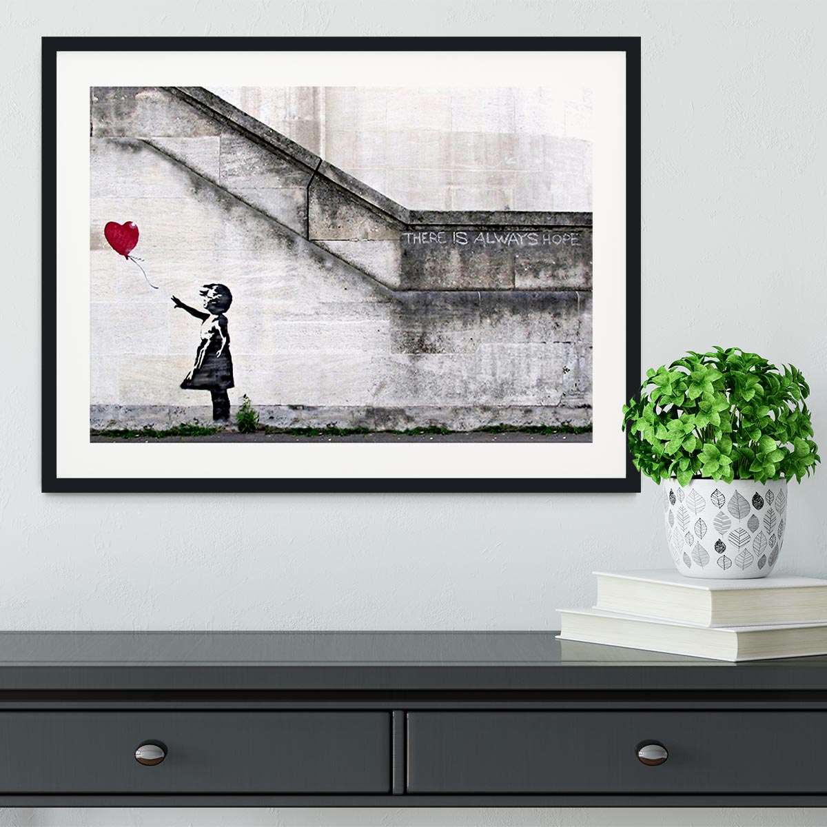
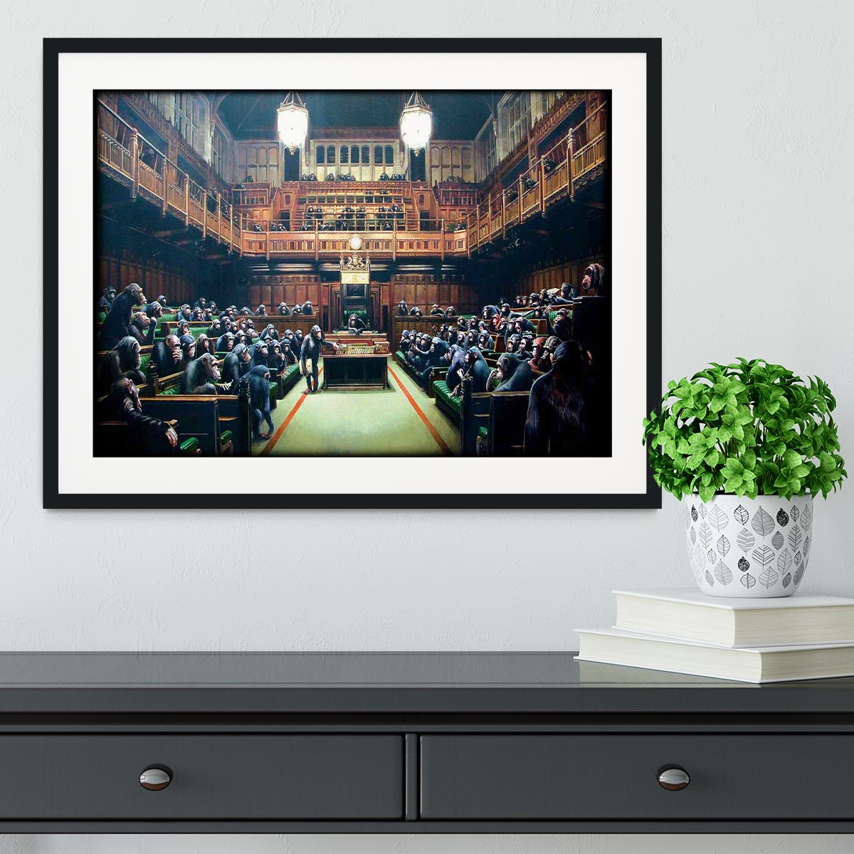
If your taste leans more urban, street-art styles can give a similar punch with a rougher edge. Our Banksy prints and Banksy framed prints are useful related routes for shoppers who want graphic wall art with more street-art attitude.
How to build a small gallery wall around one bold pop-art piece
Start with the strongest piece first. Place it at the centre or slightly off-centre, then build around it with smaller prints that share one colour, subject or mood. This keeps the wall feeling curated rather than random.
Mixing pop art with cleaner graphic prints, typography or simple abstract artwork can work well. If you want a softer modern pairing, browse abstract framed prints for colourful pieces that support the main print without fighting it.
Common mistakes to avoid with bright wall art
- Going too small: bold artwork needs enough scale to look deliberate.
- Using too many loud pieces together: one hero print is often stronger than five competing images.
- Ignoring the room colours: repeat one or two shades so the print feels connected.
- Choosing the wrong finish: canvas feels relaxed and graphic; framed prints feel cleaner and more polished.
- Hiding it on a busy wall: pop art works best where it can be seen clearly.

Shop pop art canvas prints and related colourful wall art
If you want a room to feel brighter, more personal and less predictable, pop art is a strong place to start. Choose one confident piece, give it enough wall space, and use the colours in the artwork to guide the rest of the room.
Explore our pop art canvas prints for colourful statement pieces, or compare broader canvas prints and posters, framed prints and floating framed canvas prints if you are still choosing the right finish.
