Vintage Advert Wall Art Ideas: Retro Prints for Kitchens, Home Bars and Gallery Walls
Vintage advertising prints are brilliant if you want a room to feel warmer, more characterful and less showroom-perfect. Old food, drink, travel and entertainment artwork can bring colour, humour and nostalgia into everyday spaces without needing the whole room to be themed.
Want the retro look quickly? Browse vintage prints first, then narrow the room with food and drink prints for kitchens and bars, or music canvas prints for a more playful gallery wall.
This guide looks at practical ways to use vintage advert wall art in kitchens, home bars, dining rooms, studies and gallery walls. If you already know you want the look, start with our vintage prints collection, then use the ideas below to choose the right subject, format and placement.

Why vintage advertising works as wall art
Vintage advert art has an easy charm because it was designed to catch attention quickly. Bold typography, illustrated packaging, confident colour and memorable slogans all make it work well on a wall, especially in rooms where you want personality rather than a plain decorative print.
It also gives a room an instant story. A coffee, cocktail, food or travel-inspired print can make a kitchen or bar area feel collected over time, while a playful old advert can become a conversation piece in a hallway or gallery wall.
If you enjoy the visual history side of the subject, our guide to shocking vintage adverts is a useful companion read. For buying and styling, keep the focus here on what will actually suit your space.
Best rooms for vintage advert prints
Kitchens and dining spaces
Kitchens are one of the easiest places to use retro advert prints. Food, drink, café and packaging-inspired artwork feels natural around breakfast bars, dining corners and open shelving. A single medium or large piece can warm up a plain wall, while two or three smaller prints can create a relaxed bistro feel.
For more room-specific routes, browse kitchen canvas wall art alongside vintage designs so the subject feels connected to the space rather than randomly added.
Home bars and games rooms
Home bars, games rooms and entertaining spaces can take stronger colour and humour. Drink-led posters, retro travel artwork, music references and bold typography all work well here because the room is already designed to feel social.

Studies, hallways and gallery walls
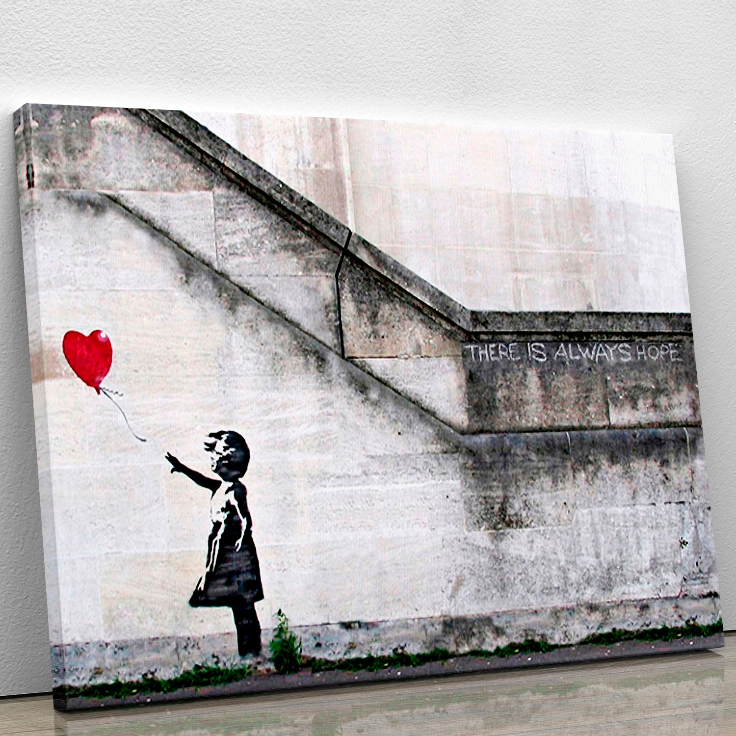
In a study or hallway, vintage advertising can add interest without feeling too formal. Choose artwork with a strong graphic shape or limited colour palette so it still feels considered. In a gallery wall, mix advert prints with related subjects such as travel, film, music or pop-art pieces to create a collected look.
How to choose the right vintage print style
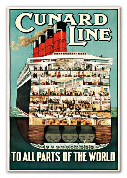
Food, drink and travel adverts
Food and drink artwork usually feels the most natural in kitchens, dining rooms and bars. Travel-inspired posters are better for hallways, studies and living rooms because they bring a sense of place as well as colour.
Humour, nostalgia and conversation pieces
Some old adverts are funny because they feel so far removed from today. Use these carefully. They can work as quirky conversation pieces, but if the room is used every day, choose imagery you genuinely enjoy looking at rather than something that only works as a joke once.
Colour palette and era
Look at the dominant colours before choosing a print. Cream, red, navy, mustard and bottle green often suit vintage schemes, while brighter mid-century palettes can feel closer to pop art canvas prints. If the room is already busy, a simpler print with two or three main colours will be easier to live with.
Canvas, poster or framed print: which format fits the room?
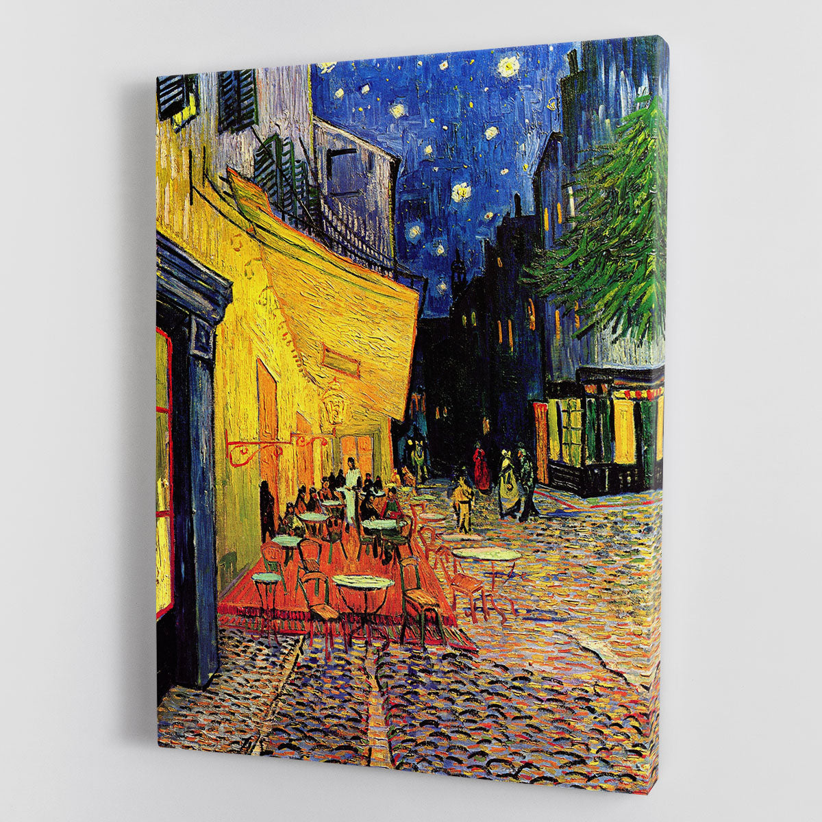
Canvas prints and posters are a relaxed choice for kitchens, games rooms and casual living spaces. They keep the look easy and graphic, especially if the artwork has strong colour or bold lettering.
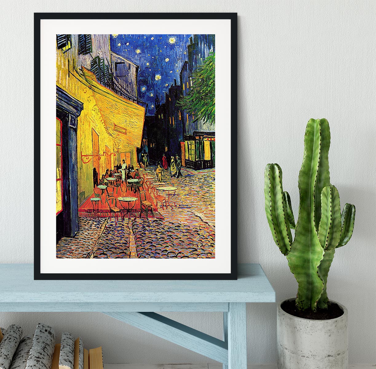
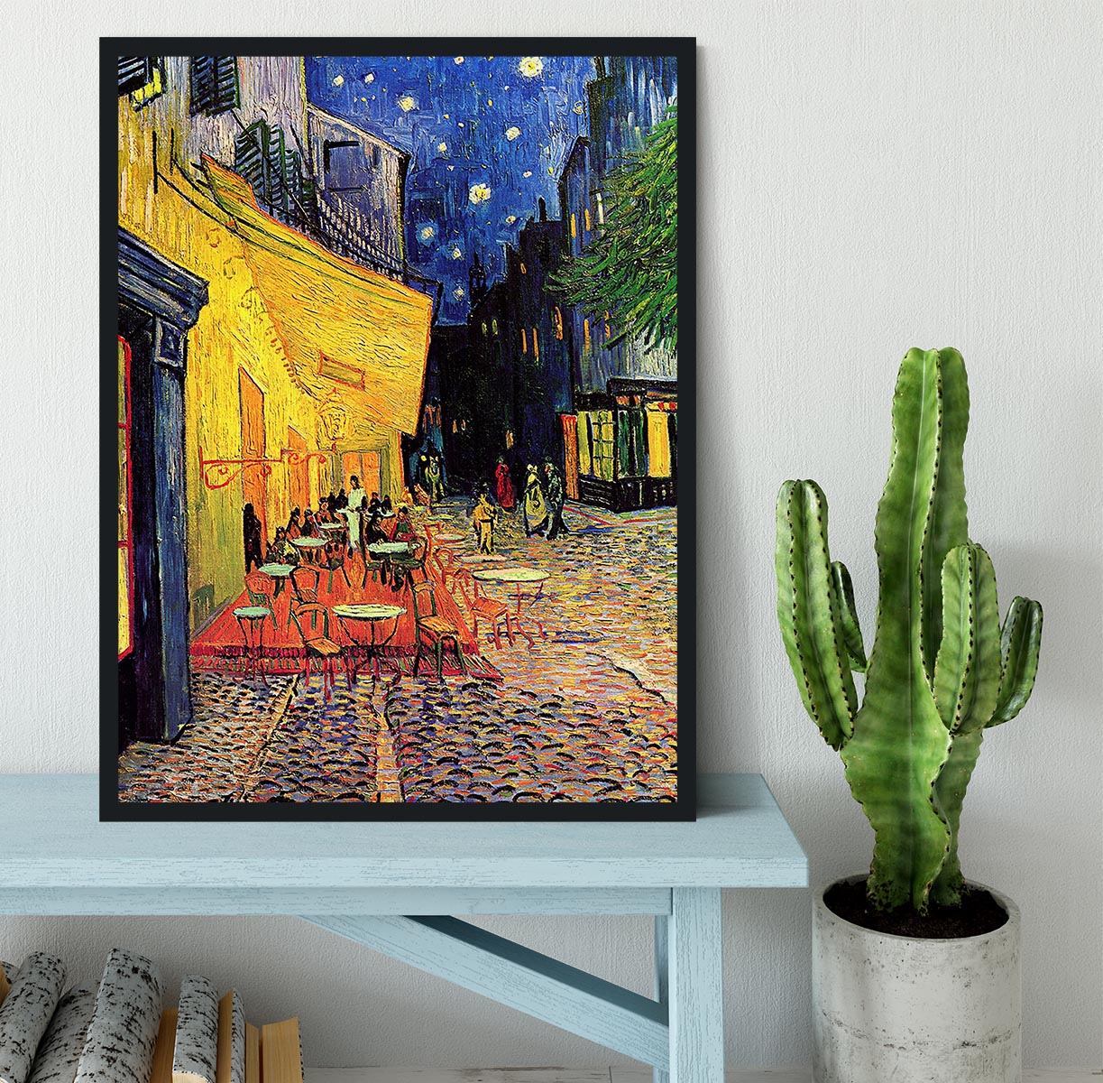
Framed prints feel sharper and more finished. They are a better fit for dining rooms, studies, hallways and gallery walls where you want the vintage subject matter to look intentional rather than thrown together.

How to build a vintage gallery wall without it looking cluttered
Start with one hero piece, then build around it with smaller prints that share a colour, era or subject. For example, a food advert can sit with café artwork, typography and a simple travel print; a film-style advert can pair with movie and TV framed prints; a music-led piece can sit with music framed prints.
- Keep one repeated colour: this helps different prints feel connected.
- Vary the scale: one larger print plus two to four smaller pieces usually looks more natural than lots of identical sizes.
- Leave breathing room: vintage artwork often has strong type and detail, so avoid packing every frame too tightly.
- Mix subjects carefully: food, drink, travel, film and music can work together if the colours and mood are aligned.
Vintage advert art to browse at Canvas Art Rocks
The simplest route is to choose the room first, then the subject. For kitchens and dining spaces, look for food, drink and café-inspired artwork. For home bars, choose bolder colour and nostalgic entertaining themes. For hallways or studies, framed pieces and travel-inspired prints often feel more polished.
Browse vintage prints for nostalgic wall art, compare broader canvas prints and posters, or use framed prints if you want a cleaner gallery-wall finish.

FAQs: vintage advert wall art
Where does vintage advert wall art work best?
It works especially well in kitchens, dining spaces, home bars, games rooms, studies and hallways. Choose the subject to match the room: food and drink for kitchens, bolder social themes for bars, and travel or typography for studies and gallery walls.
Should vintage advert prints be framed?
Framing is a good choice if you want a smarter, more finished look. Canvas or poster formats can feel more relaxed and graphic, which suits casual kitchens, bars and games rooms.
How do I stop retro wall art looking cluttered?
Use one strong hero print, repeat one or two colours, and leave space between pieces. If you are building a gallery wall, mix sizes but keep the subject or palette consistent.
What should I pair with vintage advertising prints?
Try pop art, travel prints, film artwork, music prints or simple typography. The key is to match the colour and mood so the wall feels curated rather than random.